SUZUKI
V2X Technology
Company Overview

Suzuki, a renowned name in the automotive industry, has established itself as a global leader in manufacturing automobiles, motorcycles, and outboard motors. With a rich history spanning over a century, Suzuki has consistently demonstrated a commitment to innovation, reliability, and performance. The company's diverse range of vehicles offers exceptional quality, fuel efficiency, and cutting-edge technology, making them a preferred choice for customers worldwide. Suzuki's dedication to customer satisfaction is evident in its meticulous attention to detail and the constant pursuit of excellence. With a global presence and a strong focus on sustainable mobility solutions, Suzuki continues to shape the future of transportation, delivering vehicles that embody the perfect blend of style, functionality, and driving pleasure.
Driving Innovation & Performance
Project Background
Suzuki Japan's research and development team is working on the cutting-edge V2X (Vehicle to Everything) communication technology, along with Maruti Suzuki India and IIT Hyderabad. By reducing traffic congestion and the number of accidents on the roads, this technology can help. An emergency vehicle warning system, rear-end vehicle warning system, pedestrian warning system, motorcycle warning system, and road monitoring information will all be included in the high-tech vehicle. These features will help the driver organise safety, make room for emergency vehicles, and make the roads a safer place overall.
V2X Technology Demo at IITH

The SMC, Maruti Suzuki India Limited (MSIL), and IIT-Hyderabad have joined forces to conduct research on future V2X communication technology-based vehicle usage scenarios for India.V2X communications technology can help lessen traffic, accidents, and road congestion when used in conjunction with appropriate infrastructure, traffic laws, and driver education. Prominent representatives of various government agencies were present to witness this auspicious occasion.
V2X Road Safety Use Case
Vehicle to Everything (X) is known as V2X. In order to help four-wheeler drivers navigate Indian traffic and ultimately make Indian roads safer, R and D had developed road safety features. The Engineering and Research team briefed us on the use cases before we began the design.


My Role
As a Product Design & Research Fellow, my role was to:
-
To conduct desk research on the latest trends and technologies. Review the current HMI and redesign it with user-friendly and intuitive interfaces. A component of the research involved user testing and interviews for these products.
-
develop a visual language that is consistent with the brand identity.
-
Set up and carry out in-car testing, then submit the results.
-
To inform the stakeholders of the progress and solicit feedback, make a design presentation.
-
Coordinating among teams to ensure effective collaboration and timely completion of the task.
-
Reiterating the design in light of suggestions made during the workshops.
My Learnings
Working on the Suzuki Automobile Project has been a transformative experience for me. Throughout the project, I have gained invaluable insights into the automotive industry and witnessed firsthand the power of innovation and customer satisfaction. One key learning is the vital role of continuous innovation in driving success.
Another crucial learning from the project is the significance of customer-centricity. By actively listening to stakeholder's and team's feedback and understanding their expectations, I was able to design and develop the product which might result in high customer satisfaction and brand loyalty. Witnessing the Suzuki team's seamless coordination and collective effort to bring their vision to life has emphasized the importance of collaboration in achieving ambitious goals. By leveraging the diverse skills and perspectives of team members, the project's outcomes were strengthened, and challenges were overcome more efficiently.
The Design Process
Secondary research
A report was made showing the review and feedback on the HMI on functionality and usability aspects using specific groups that were identified. And the study is used for the development of HMI designs in the second phase.
The Functionality aspects are evaluated using the following methodology:
-
User Persona
-
Case Study
-
User Journey
-
Functionality Recommendations
The functionality and usability of each HMI are assessed based on the user groups that were determined based on the "actors" present during the demonstration. The iterative process of the functional evaluation starts with the creation of user personas to better understand the needs of the user. User personas are used to map the user's experience journey after being used to comprehend the needs and goals of the user.
In order to gain user insights and use them to further draw conclusions, one HMI case study with related use cases was examined. The user's actions at each stage of the app are then used to create the journey map. Each time, the task flows are double-checked, and their feelings and trouble spots are recorded.
The review is based on these pain points and subsequent opportunities identified. The collated pain points must be resolved, and opportunities implemented in the final prototype.
User Persona

Novice User
Nalini Venugopal
Occupation: Home Maker
Age: 34 years
About: She is married and has 3 Children
Location: Chennai, India
Hobbies: Cooking & Sewing
Social Circle: College Friends, Social Meetings
Attributes: Introvert, Ignorant, Forgetful
Goals
Her husband recently purchased a Valeno, but she is not a driver. She wants to learn how to drive though, as it will help her with her daily tasks (like going to the market).
Needs
To be responsible, learn to drive so she can provide for her family, to exercise caution when driving.
Motivation
able to operate a vehicle on the city's congested roads.
Fears
Personal and family safety, difficulty making decisions, unable to learn to drive, being incapable.
Challenges
Learn how to drive a car, deal with doubt, and pressure from others

Experienced User
Amal Nair
Occupation: Team Lead of NoC
Age: 31 years
About: He lives with his roommates
Location: Cochin, India
Hobbies: Travelling, Cooking & Gaming
Social Circle: College Friends, Office Friends, Online Friends though Social Media
Attributes: Cautious, Anxious, Ambitious, Nervous
Goals
He is a workaholic who frequently relies on the weekend to unwind. He enjoys driving his Valeno on the highway. He wants to have a calm, anxiety-free drive when travelling a long distance.
Needs
To maintain a healthy work-life balance, To travel on the weekends so he can get away and spend time doing the things he loves.
Motivation
The drive to live a balanced life.
Fears
Driving safely for himself, He fails to enjoy his weekend, His weekend is being taken away by work.
Challenges
Inability to make a quick decision, self-doubt, getting a weekend off after a long, busy week, driving with caution.
Considering seasoned, novice and trainee drivers, we laid out experience goals
- The alerts should visually distinguish themselves from each so that those could be comprehended by the driver emphasis on important elements without constantly looking at the screen.
- Visual interface should be clean, minimal and should put other emphasis on important elements.
- The system should give explicit instructions to the driver about how to mitigate the situation.
- Visual alert to be accompanied by an audio as well.
Ul explorations - Low & High Fidelity
After the Research, We starting ideating on the wire-framing, while considering certain aspects of the UX heuristic of Automobolie
Industry. We held multiple brainstorming sessions and internal feedback meetings within the design team for development of the
design to the fullest
The considered rules were :
-
High contrast
-
Icons over text, but have to be obvious
-
Reduce the number of call to action
-
Minimum font size
-
Short text, no paragraphs
-
Safety and usability before beauty
-
Use clear affordances
-
Consider reachability and readability of the screen
-
Preferred gestures
Visual & Information hierarchy
Based on the UX heuristic of the IVI, we categorised on which basis information needs to displayed to the user and more priority was given to safety while design the HMI.
MOST IMPORTANT
Use Case
(Alert Type)
Proximity
Direction
Call to Action
IMPORTANT
Indication in Map
LESS IMPORTANT
Detailed Alert Information
Wireframes & Iterations
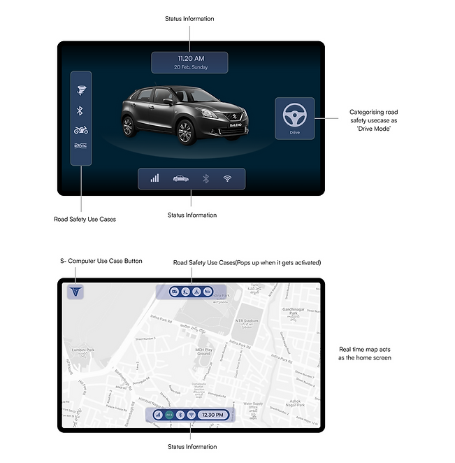
Based on the hierarchy and study that we did on HMI, we started planning out layout for the car HMI or IVI

High Fidelity (Home Screen)
Iteration 01
We initially explored two different ideas in terms of layout and colour theme. One was light theme and other dark theme.


Iteration 02

Iteration 03

Sun Load Testing
We did sunload testing to understand whether dark or light theme works better in car HMI. It was quite evident the contrast and visibility , in the light theme turned out to be working better in real life lighting conditions.

Dark Theme
Light Theme
Call To Action
To provide clear instructions on how to lessen the seriousness of the situation, we experimented with various layout options. To further improve readability and draw the user's attention, CTA action information was added to the final design and placed in the centre panel with the other information.


How It Works ? Demo Guide
To help users understand how the technology functions, we have introduced presentation guidelines for each use case. Due to the potential for distraction while driving, we chose to keep it as an option.


We closed vertical how it works information panel because they are compatible with other vertical maps. It also helped us to maintain the hierarchy within the HMI screens.
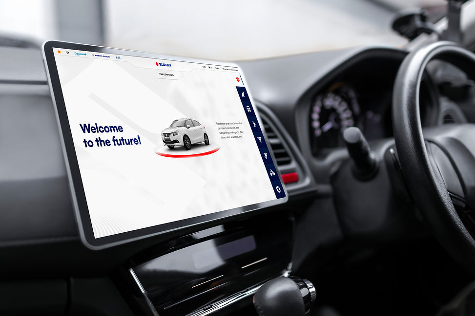
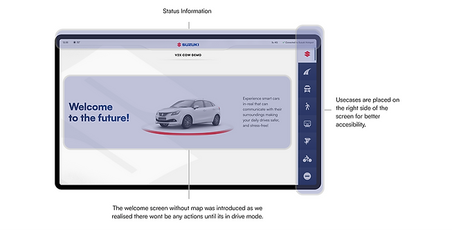
After initial iterations we decided upon placing the information on the right side of the screen better readability for the user. And while it turned off it will project the brand logo.
Alert Proximity Indication
We experimented with colours to show that the proximity to an approaching vehicle or object is decreasing as the colour changes from yellow to red in order to improve the alert experience. However, when using it outside in the sunlight, the experience proved to be distracting and the colour contrast was not as apparent as anticipated.
We have used the red colour indication for the same in the final designs to reduce the cognitive load on the user even more.

Final Screens
Major High Fidelity screens are shared below, rest of the screen can be viewed in prototype in the below section.
Home Screen

Alert Screens


Prototype
In-Car Testing
After development, we underwent rigorous testing in cars to determine the design's integrity. We then iterated the design in response to customer needs, and feedback was provided to the development team in order to address any problems that arose following the development of the screens. During the testing sessions, we looked at the design's overall functionality, readability, reachability, and the screen's overall features (contrast, icon size, and font size).
After the product had finished development, it was evaluated by actual users to gather feedback and opinions and identify any gaps before moving on to the next stage of changes.

The Team
I want to express my sincere gratitude to each and every member of the project team. Working with all of you on the Suzuki Automobile Project has been an incredible experience. Your dedication, expertise, and collaborative spirit have played a significant role in the project's success. I am truly grateful for the opportunity to work alongside such a talented and passionate group of individuals. Your contributions, teamwork, and unwavering commitment to excellence have made a lasting impression on me. Thank you for your hard work, professionalism, and for making this project an unforgettable journey.


